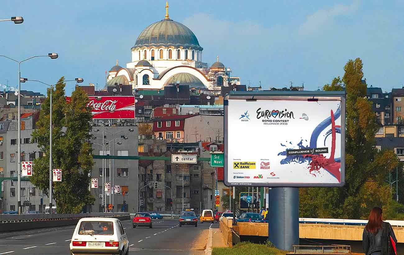
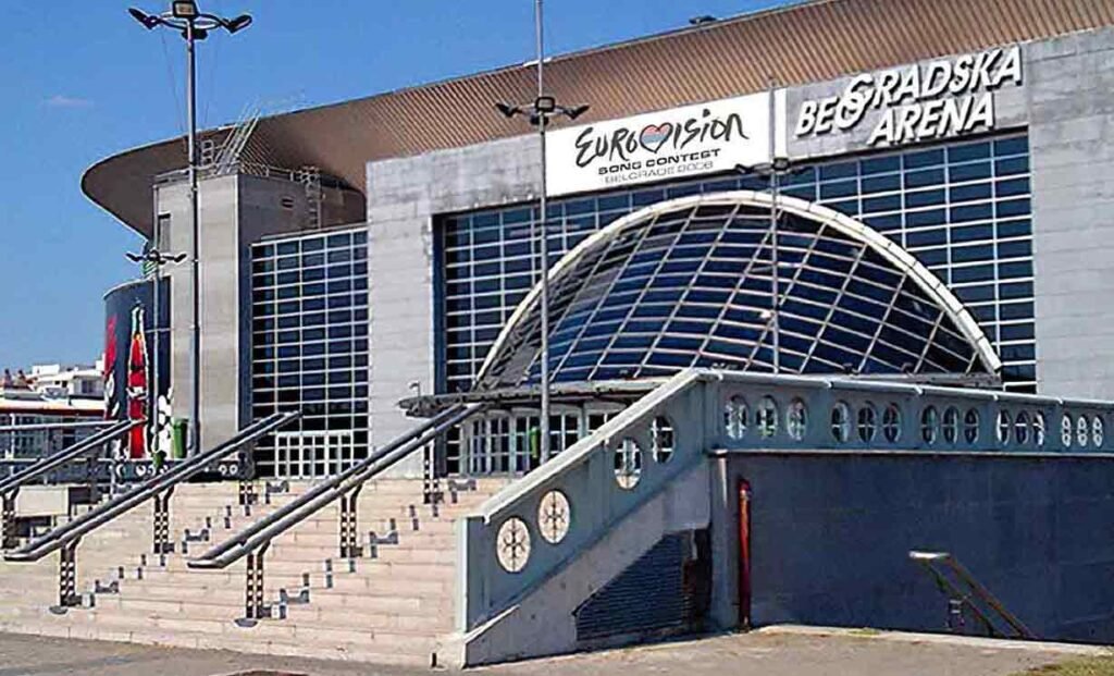
In 2008, our graphic designer Nikola had the privilege of spearheading the poster design campaign for the Eurovision Song Contest. Charged with capturing the essence of this iconic event through visual storytelling, he embarked on a creative journey to craft posters that would resonate with audiences worldwide.
The outcome of our collaboration with Eurovision 2008 was a series of posters that not only adorned city streets and promotional materials but also captured the hearts and imaginations of audiences worldwide.
Our designs served as powerful ambassadors for the event, sparking conversations and fostering a sense of community among fans. By seamlessly blending creativity, innovation, and strategic thinking, we succeeded in leaving a lasting impression on the Eurovision legacy in 2008 and beyond.
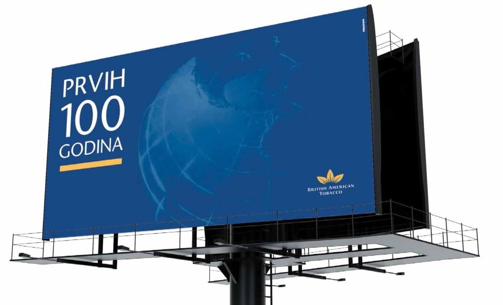
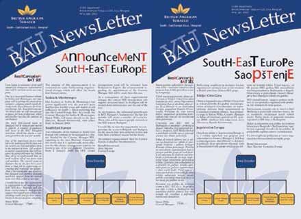
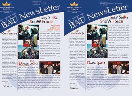
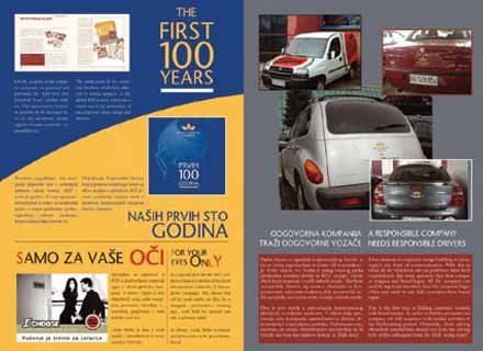
In 2012, members of our team embarked on a prestigious endeavor to commemorate the first 100 years of British American Tobacco through visually captivating posters and publications.
This marked the beginning of a fruitful and enduring collaboration that continues to this day.
Our approach to the graphic design of posters and publications for BAT’s centennial celebration was rooted in honoring the rich heritage, and global impact of the company over the past century.
Drawing inspiration from BAT’s legacy of excellence and leadership in the tobacco industry, we conceptualized designs that blended tradition with modernity.
The graphic design work produced for BAT’s centennial celebration made a profound impact, not only as visually striking pieces but also as powerful storytellers that resonated with stakeholders and audiences worldwide.
Furthermore, our successful collaboration with BAT since 2012 is a testament to the effectiveness of our design solutions in fostering long-term partnerships built on trust, creativity, and innovation.
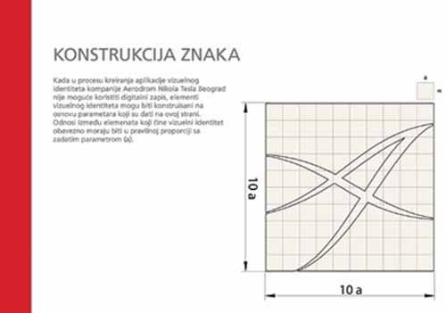
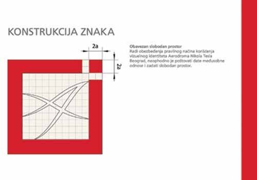
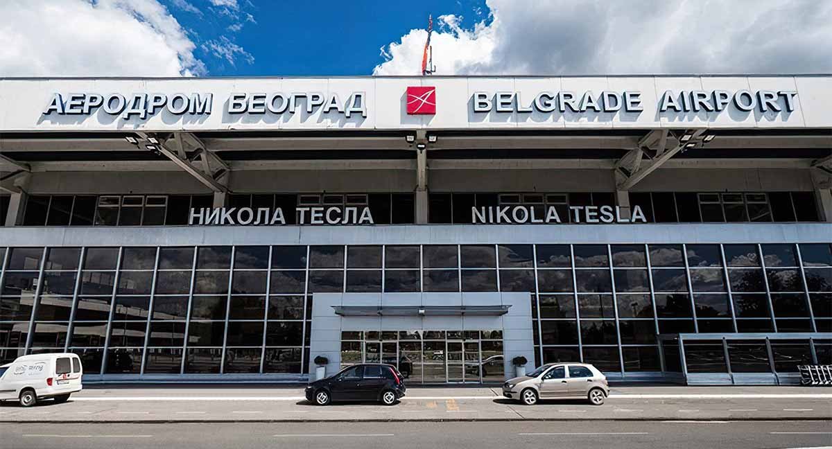
Our designers collaborated with Nikola Tesla Airport in Belgrade to modernize its visual identity standards. Our goal was to create a contemporary and cohesive brand image that reflects the airport’s significance as a key transportation hub.
Approach:
Research and Analysis
We delved into the airport's history, community importance, and current branding trends.
Collaborative Workshops
Engaging stakeholders actively ensured alignment with the airport's vision, mission, and values.
Design Iterations
Multiple concepts were meticulously crafted and refined based on comprehensive feedback to effectively meet objectives.
The new identity enhances the airport’s brand presence, fosters consistency across all touchpoints, and reinforces its position as a premier travel destination in the heart of Belgrade.
Our team developed a refreshed logo that symbolizes Nikola Tesla Airport’s forward-thinking approach and its role as a gateway to the world.
Comprehensive branding guidelines were created to provide clear instructions on logo usage, color applications, typography, and other visual elements across various mediums.
We designed signage and environmental graphics that not only guide passengers seamlessly through the airport but also contribute to a memorable and welcoming atmosphere.
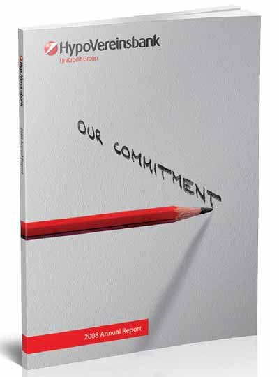
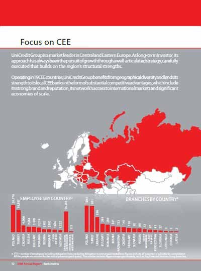
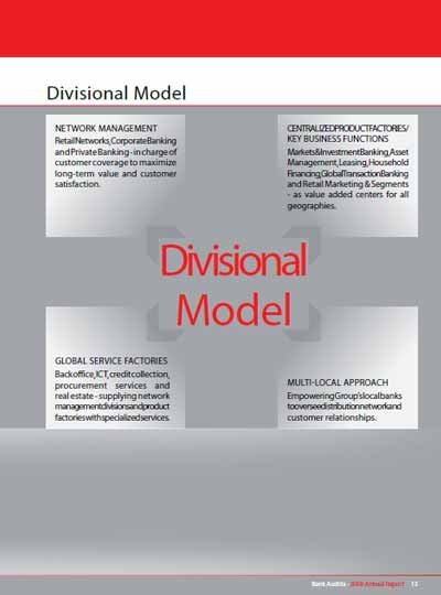
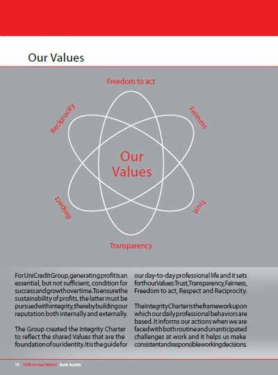
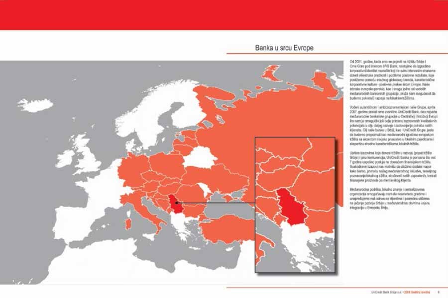
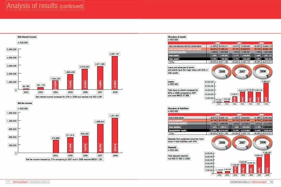
We proudly present the annual report designed for UniCredit Bank, encapsulating a year of milestones, achievements, and strategic growth. Our collaboration with UniCredit Bank aimed to produce a comprehensive and visually engaging report that communicates the bank’s financial performance, corporate values, and future outlook to stakeholders.
Our partnership with UniCredit Bank involved close collaboration with key stakeholders, including executives, finance teams, and communications specialists. Through iterative design reviews and feedback sessions, we ensured that the final product accurately represented UniCredit Bank’s brand identity and effectively communicated its message.
The annual report serves as a comprehensive and visually impactful tool for UniCredit Bank to communicate its financial performance, corporate values, and strategic priorities to stakeholders. It reinforces the bank’s commitment to transparency, accountability, and excellence while showcasing its achievements and future aspirations.
At Shoptimist, we are dedicated to delivering creative and strategic solutions that empower our clients to achieve their goals.
Contact us to learn more about how we can elevate your brand’s communications through compelling design and storytelling.
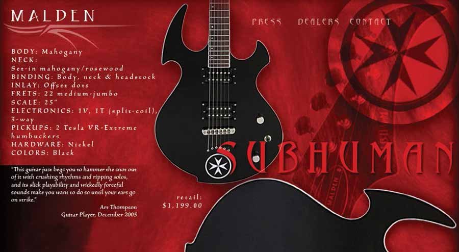
In 2009, our teammate Nikola Cvetkovic embarked on an exciting collaboration with Malden Moritz, the visionary owner of Malden Guitars, to create a guitar tailored for fans of the hardest heavy metal sound.
Malden expressed frustration with previous attempts to design such a guitar, as he preferred the aesthetic of instruments from the sixties and seventies over modern designs. He sought a guitar that embodied the essence of heavy metal – sleek, menacing, and visually striking in black. He desired an instrument that not only sounded powerful but also exuded an aura of danger and fear.
Determined to meet his unique requirements, Nikola eagerly accepted the challenge.
Inspiration from Nature:
Drawing on Malden’s fear of spiders, Nikola found inspiration in the arachnid’s silhouette and menacing presence. The iconic shape of the Malden Subhuman guitar was born from this primal fear, with its sleek contours and sharp angles mirroring the essence of the spider.
The design process was dynamic and collaborative, with sketches and concepts evolving over numerous iterations. Through constant communication and feedback, our designer refined the shape and details of the Subhuman model to perfection.
Prototype Development:
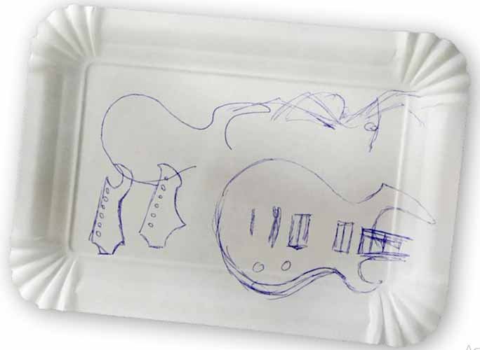
The first sketch for this guitar was created in a café bar, on a paper plate.After finalizing the design, the designer worked closely with skilled craftsmen to bring the Subhuman guitar to life. Precision engineering and meticulous attention to detail ensured that the final product met Malden’s exacting standards.
From the paper plate to a real instrument, several months passed. Now, the Malden Subhumen guitar is a favorite among young guitar players.
Listen to how it sounds.
Continued Collaboration:
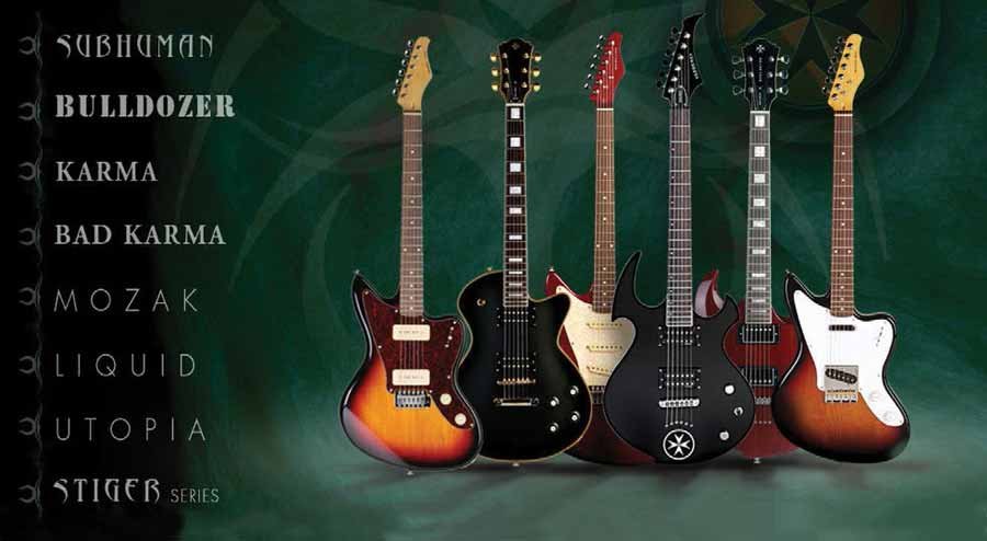
Following the successful creation of the Subhuman model, the partnership with Malden Guitars flourished. Recognizing the synergy between our teams, Malden Moritz entrusted us with additional projects to enhance the brand’s identity and expand its product offerings.
We continued to collaborate with Malden Guitars on various design initiatives.We developed visually captivating and functional packaging solutions to complement the unique aesthetic of Malden Guitars. Our designs ensured that each guitar was presented with the utmost care and attention to detail, enhancing the unboxing experience for customers.
We also designed a range of branded merchandise, including t-shirts, hats, and accessories. These products not only served as stylish accessories for fans of Malden Guitars but also contributed to brand recognition and loyalty.
From promotional materials to advertising campaigns, we worked closely with Malden Guitars to develop compelling marketing collateral that effectively communicated the brand’s values and offerings.
We are dedicated to nurturing long-term relationships with our clients, helping them achieve their goals and surpass expectations.
Contact us to discover how we can elevate your brand and create impactful design experiences across a variety of mediums.